Wednesday, June 29, 2011

MEASURE OF CENTRAL TENDENCY ( MEDIAN) FOR STATISTICS O LEVEL/IGCSE

The median is defined as a value which divides the data set that have been ordered, into two

equal parts, one part compromising of observations greater than and the other part smaller than it.


Median=(n/2)th value ( for single set of observations)

Median= L+h/f(n/2-C) for frequency distribution

Note: For odd number of observations we use n+1 in the place of n, above mentioned formulas.


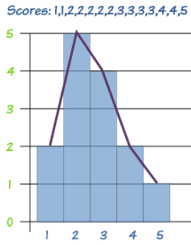
Example: find the median

3, 4, 5, 1, 6, 4,1,8

To find the median first we have to arrange it in ascending order

1,1,3,4,4,5,6,8

Solution:

Median=(8/2)th value

Median=4th value

Median=4


Median frequency distribution example

Class Intervals

Class Boundaries

Frequency

CF

16-19

15.5-19.5

2

2

20-23

19.5-23.5

8

10

24-27

23.5-27.5

18

28

28-31

27.5-31.5

15

43

32-35

31.5-35.5

6

49

36-39

35.5-39.5

1

50

Ef=50

Median value= 50/2= 25th value

Median=L+h/f(n/2-C)

Median=23.5+4/18(25-10)

Median=26.83

Graphical Determination of the Median

1. With the help of cumulativee frequency curve

Median=n/2 where n=sum of all frequencies.


200/2=100th

Median is between 439.5 and 449.5. Median in statistics can also be called Q2 or Median Quartile.


Advantages of Median

  1. It is easily calculated and understood
  2. It is located even when the values are not capable of quantitative measurement.
  3. It is not affected by extreme values
  4. It can be located graphically
  5. It can be easily located even if the class intervals in the series are unequal

Disadvantages of Median

  1. It is not subjected to algebraic treatments.
  2. It cannot be used in further statistical treatment
  3. It does not have sampling stability
  4. It does not take into account the values of all items in the series.

USES

  • It is useful in those cases where numerical measurements are not possible.
  • It is also useful in those cases where mathematical calculation cannot be made in order to obtain the mean.
  • It is generally used in studying phenomenon like skills, honesty, intelligence etc.

MEASURE OF CENTRAL TENDENCY ( MEAN) FOR STATISTICS O LEVEL/IGCSE

INTRODUCTION

The tendency of the observations to cluster in the central part of the data set is called central tendency and the summary value as a measure of central tendency.


TYPES OF AVERAGES

MEAN

It is defined as the value obtained by dividing the sum of all the observations by their number. Formula given below


Mean=sum of all the observations / number of the observations

Or

Mean = xi/n (for single set of observations)

Mean = ƒx / ƒ (for frequency-distributions)

Example: find the mean of the following set of numbers.(single set of observation)

146,164,157,171,167,182.

Solution

Mean=xi/n

Mean = (146+164+157+171+167+182)/6

Mean=6

Example:( for frequency distribution)

x

f (frequency)

f(x) multiply

0

5

0

1

10

10

2

5

10

3

10

30

4

5

20

10

2

20

Sum:

37

90

Step 1. Multiply ƒ(x)

Step 2. Sum ƒ, Sum ƒ(x)

Step 3:ƒx/ƒ : 90/37=2.43


ADVANTAGES OF MEAN

  1. It is based on all the observation in the data.
  2. It is easy to calculate and comprehend.
  3. It is determined for almost every kind of data.
  4. It is the best measure to compare two or more series of data.


DISADVANTAGES OF MEAN

  1. It is greatly affected by extreme values in the data.
  2. It cannot determine for the quantitative data.
  3. It cannot be calculated if all the values are not known.

USES

  • A common man uses mean for calculating average results.
  • It is extensively used in practical statistics.
  • Estimates are always obtained by mean.
  • Business man uses it to find the cost or profit per unit of article.

Tuesday, June 28, 2011

FREQUENCY CURVE/POLYGON

FREQUENCY POLYGON

A frequency polygon is obtained by plotting the frequency of the class against its class marks, and joining the parts with line segments.

Frequency polygon can also be drawn with the help of histogram by joining their mid points of rectangle.
To view enlarged image visit
source of image: http://www.mathsisfun.com/data/images/frequency-polygon.gif

Frequency Curve

When the consecutive points on the graph join with a specific pattern smoothly shown in the below example. Frequency curve can also be drawn with the help of histogram by joining their mid points of rectangle. Frequency polygon and frequency curves are same except frequency curve is drawn using free hand and frequency polygon is drawn using scale. (Each point is joint using scale)

image source: https://onlinecourses.science.psu.edu/stat504/sites/onlinecourses.science.psu.edu.stat504/files/lesson01/frequency_curve.gif

CUMULATIVE FREQUENCY CURVE

The cumulative frequency curve/polygon is obtained by plotting the cumulative frequency against the upper class boundary.

In cumulative frequency curve we draw using using free hand and in cumulative frequency polygon we draw each point using scale.

EXAMPLE

image source: http://www.singaporeolevelmaths.com/wp-content/uploads/2008/12/cumulativefreqcurve1.PNG

To draw this graph we have to make cumulative frequency table. We add up all the frequency step by step.

For example

F

C.F

2

2

4

6

10

16

5

21

4

25


After calculating CF which is cumulative frequency we plot the points and join it.

NOTE: If you want something additional to be added please comment on this post.


NOTE


NOTES FOR STATISTICS O LEVEL WILL SOON BE AVAILABLE ON THIS BLOG FOR THE STUDENTS APPEARING IN OCTOBER/NOVEMBER 2011. ALSO ACCOUNTS NOTES WILL BE AVAILABLE TO YOU BY THIS WEEK COVERING YOUR THEORY PART AS WELL AS SUITABLE FORMATS. TWO TOPICS OF ECONOMICS NOTES HAVE BEEN PUBLISHED BY OUR TEAM. NOTES FOR OTHER SUBJECTS WILL ALSO BE PUBLISHED. IF YOU WANT TO SUGGEST ANYTHING TO US OR IF YOU NEED ANY USEFUL RESOURCES YOU CAN EMAIL US ON information.osk@gmail.com

Monday, June 27, 2011

PIE-CHART FOR STATISTICS O LEVEL/IGCSE


It is a graphic device consisting of a circle divided into sectors or pie-shaped devices whose areas are proportional to the various parts into which the whole quantity is devised Angle = Component part x 360/whole quantity


For example If total number of students from UK were 10 out of 50 we will first divide 10 by 50 then will multiply it by 360 according to the formula mentioned above. In the same way we will calculate each and every thing and using these figures we will draw pie chart shown above.


ADVANTAGES

• It is useful when projections are more important than the numerical values. • It provides a strong visual impact.

DISADVANTAGE

• It can not be drawn quickly as bar chart.

COMPARATIVE PIE CHART

The set of data can be compared by using two different pie charts. The area of the circles is proportional to the total quantities they represent.

The r1 and r2 be,the radius of the circles which represent the total TI and T2 respectively. Then

T1/ T2 = (r1/ r2)2


This formula is applied when two pie chart similar to each other are given then we will apply formula given T1/T2=(r1/r2)2. Information is always given in the question or labelled on the pie chart.


HISTOGRAM

A histogram consists of a set of adjacent rectangles whose bases are marked off by class boundaries on the x-axis and whose heights proportional to the frequencies associated with respective classes. The area of each rectangle represents the respective class frequencies.

1. Histogram for equal class intervals.

Example

2. Histogram for unequal class intervals.

(a). Frequency density method

If the class intervals of the distribution are different, then the heights of the bars are proportional to the frequency density.

Frequency density = frequency / class width

In this we have to draw histogram using frequency density instead of frequency


histogram frequency density clss width


image taken from http://passmath.co.uk/gcse-mathematics.html


(b) Height of the rectangle

If the class intervals of the distribution are different, then

height of rectangle=frequency/standard


PICTOGRAM FOR STATISTICS O LEVEL/IGCSE


It is customary to represent a unit value of the data by a standard symbol or a picture and the whole quantity by an appropriate number of repetitions of symbol concerned.

Example shown above. In October 2 bars of ice creams were sold, In June 3 scoop and a quarter were sold. In November 1 and half bars of ice creams were sold and so on.

ADVANTAGES

·It is a popular device for presentation

·It is attractive, and have strong visual impact

DISADVANTAGES

·It can only show simple information.

· Any number or quantity less than that represented by an isotope has to be represented by a fraction of it, and this is not accurate.

Friday, June 17, 2011

PRESENTATION OF DATA AND BAR CHART)

CLASS LIMITS

Number of variables which describes classes: the smaller number is the lower class limit and the larger number is the upper class limit.

CLASS BOUNDARIES

They are precise number which separate one class from another.

CLASS WIDTH OR INTERVAL

It is the difference between the class boundaries

FREQUENCY DISTRIBUTION

The organization of set of data in a table showing the distribution of the datainto classes or groups together with the number of observations in each class or group is called a frequency distribution

CUMULATIVE FREQUENCY DISTRIBUTION

The total frequency of a variable from its one end to a certain value called the base is known as the cumulative frequency distribution.

SIMPLE BARCHART

A simple bar chart consists of a horizontal or vertical bars of equal width and lengths proportional to the values they represent.

EXAMPLE: The following table shows the enrolment in a school. Illustrate the data with a simple bar chart.

Advantages

  1. It can be drawn quickly
  2. The ratios of the bars are readily seems.
  3. Can also be used to show values of non numerical categories such as months, different brands etc.

Disadvantage

  1. One simple information can be shown

MULTIPLE BAR CHARTS

It shoes 2 or more characteristics corresponding to the values of a common variable in the form of grouped bars, whose lenghths are propotional to the values of the characteristics and each of which is shaded differently to aid identification.

Advantages

  1. This type of chart is useful when dealing with two or three categories
  2. Comparing categories with in days, a year and the categories b/w the years.
  3. By comparing the heights of the bars we are able to see not only the trend, but the difference between the sales of two items for each of the specific periods of time.

Disadvantage

  1. It is even more different to group readily the relation between two or three test of figures.

COMPONENT/COMPOUND BAR CHART

It is in which each bar is divided into two or more sections, propotional in size to the components parts of a total being displayed by each bar.

They are used to represent the cumulative of the various components of data and the percentages. They are also known as sub divided bars.

1. Sectional percentage bar chart


2. SubDivided BarChart


Advantages

  1. It is generally used to compare the budget of different families

Disadvantages

  1. It doesn’t show the actual amount

Friday, June 10, 2011

STATISTICS O LEVEL TOPIC 1: INTRODUCTION AND PRESENTATION OF DATA


INTRODUCTION

The word statistics which comes from a Latin word status meaning political state . The word statistics is defined as a disciplined that includes procedures and techniques used to collect, process and analyses numerical data to make inferences and reach to decisions in the face of uncertainty.

IMPORTANCE OF STATISTICS

  1. Statistics assist in summarizing the larger set of data in a form that is easily understandable.
  2. Statistics assists in the different stages of labrotary and field experiments as well as surveys.
  3. Statistics assists in drawing general conclusions and in making prediction of how much of a thing will happen under given conditions.
  4. Statistical technique being powerful tools for analysing numerical data are used in almost every branch of learning.
  5. A business man, an industrialist and research worker all employs statistical methods in their work
  6. Social scientist also uses statistical methods in various areas of socio economic life of a nation.

DATA

Collection of fact and figures in raw form is called data.

QUALITATIVE DATA

Those variables which cannot be expressed numerically for example beauty, satisfaction etc.

QUANTITATIVE DATA

Those variables which can be expressed numerically such as age, weight and population etc. for example 30 kg weight, this is numeric data.

DISCRETE VARIABLES

Variables that can take only discrete integers or whole number not decimal number. For example ( 1, 2 , 3 ,4). Number of students in the class.

CONTINOUS VARIABLES

Those variables that can take on any value fractional/decimal with in given interval. For example height of the students.

DISCRETE QUANTITATIVE DATA

Number of trees in a park

Number of students in the college.

DISCRETE QUALITATIVE DATA

Number of intelligent students in the class

Number of White cars in the car park.

CONTINOUS QUANTITATIVE DATA

Weight of the student

Length of trees in a park.

CONTINOUS QUALITATIVE DATA

Tallest tree in the jungle

Highest peak of the mountain.

Thursday, June 9, 2011

GOODS AND SERVICES EXAMPLE


GOODS EXAMPLE ARE
television
Computer
Headphone
Laptops
Sofa
Telephone
Air Conditioner
Table


Specialization and Exchange

Economy is an area in which people make and produce goods and services. It can be of any size. We can talk about local economy for example of small state, city etc ( economy of London, economy of Mumbai etc), National economy is a country’s economy for example UK economy, London economy is a part of UK’s economy. UK economy is a part of Europe economy, Japan is a part of Asian economy. This all makes up the Global Economy.

Private Sector: In private Sector, all firms organizations, companies are run, owned and controlled by private people/individuals or organization. They mainly aim for profit making. Example of private sector includes Royal Bank of Scotland, Standard Chartered Bank etc.

Public Sector: In public Sector all firms organizations, companies are owned run and controlled by the Government for example armed forces, public parks, hopitals, state schools.

Production is a process which satisfies human wants.

Goods are tanjible items which are produced to meet human needs and wants for example television, car, shoes etc.

Services are injangible items which also satisfies human needs and wants for example insurance, carpet cleaning service etc.

Producers are people who make and sell goods

Using up of goods is known as consumption

Consumer are people who spend on buying goods and services and their expenses are known as consumption expenditure.

For anything to be produced we need resources. Factors of productions are resources which input its effort to produce something which includes man made and natural resources.

They are

  1. Land
  2. Labour
  3. Capital
  4. Enterprise

Land

We ofcourse need land be get something produced. For example fertile soil for agriculture which is natural resource, piece of land for factory etc.

Labour are man power who input their efforts. They are people/workers who provide their mental and physical efforts. There many types of labour Unskilled labour, semi Skilled labour, high skilled labour. Example factory workers, managers, staff etc.

Capital is an investment to produce something which includes tools, machinery, hammer, metal etc.

Enterprise is a business run by entrepreneurs who are owners or risk taker/decision maker of the business. Profit is a reward for him.

There are many types of Goods

Consumer goods are produced for consumers which includes durable and non durable goods. Durable goods last for long time example television, computer, DVD player etc. Non-durable goods last for short period example food drink etc.

Capital Goods help to produce other goods and services which a firm may buy for production. The spending on capital goods in known as investment. Example machinery.

Public Goods are provided by the government even if no one pays for it. Example street light, law and order, environment protection.

Merit Goods are provided by the government so that people may benefit from it. Example state school, health care etc. In public sector government provides this.